react好租客项目Day01-项目演示&项目搭建&antd-mobile的TabBar使用

react好租客项目Day01-项目演示&项目搭建&antd-mobile的TabBar使用
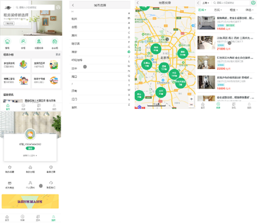
Ramsayi好客租房移动 Web - 上
目标
- 能够初始化项目
- 能够使用 antd-mobile 组件库
- 能够完成项目整体布局
- 能够理解嵌套路由
- 能够使用 antd-mobile 提供的 TabBar 组件
- 能够对 TabBar 进行定制
- 能够实现首页路由的处理
项目介绍
- 好客租房 - 移动 Web 端
- 项目介绍:本项目是一个在线租房项目,实现了类似链家等项目的功能,解决了用户租房的需求
- 核心业务:在线找房(地图、条件搜索)、用户登录、房源发布等
技术栈
- React 核心库:react、react-dom、react-router-dom
- 脚手架:create-react-app
- 数据请求:axios
- UI 组件库:antd-mobile
- 其他组件库:react-virtualized、formik+yup、react-spring 等
- 百度地图 API
项目准备
项目搭建(★★★)
- 本地接口部署
- 创建并导入数据:数据库名称 hkzf(固定名称)
- 使用脚手架初始化项目
- 使用 npx create-react-app hkzf-mobile
- 进入到项目根目录 使用 npm start
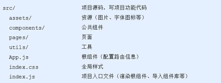
项目目录结构(★★★)
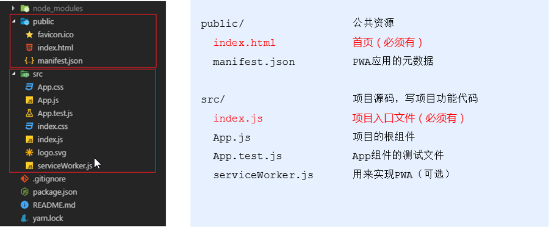
- 调整项目结构
antd-mobile 组件库(★★★)
介绍与使用
- 打开 antd-mobile 的文档
antd-mobile是 Ant Design 的移动规范的 React 实现,服务于蚂蚁及口碑无线业务。
特性
- UI 样式高度可配置,拓展性更强,轻松适应各类产品风格
- 基于 React Native 的 iOS / Android / Web 多平台支持,组件丰富、能全面覆盖各类场景 (antd-mobile-rn)
- 提供 “组件按需加载” / “Web 页面高清显示” / “SVG Icon” 等优化方案,一体式开发
- 使用 TypeScript 开发,提供类型定义文件,支持类型及属性智能提示,方便业务开发
- 全面兼容 react / preact
适用场景
- 适合于中大型产品应用
- 适合于基于 react / preact / react-native 的多终端应用
- 适合不同 UI 风格的高度定制需求的应用
快速上手
创建一个项目
安装
- npm install antd-mobile –save
使用
- 导入组件
- 导入样式
1
2
3
4
5
// 导入组件
import { Button } from 'antd-mobile';
// 导入样式
import 'antd-mobile/dist/antd-mobile.css'; // or 'antd-mobile/dist/antd-mobile.less'
ReactDOM.render(<Button>Start</Button>, mountNode);
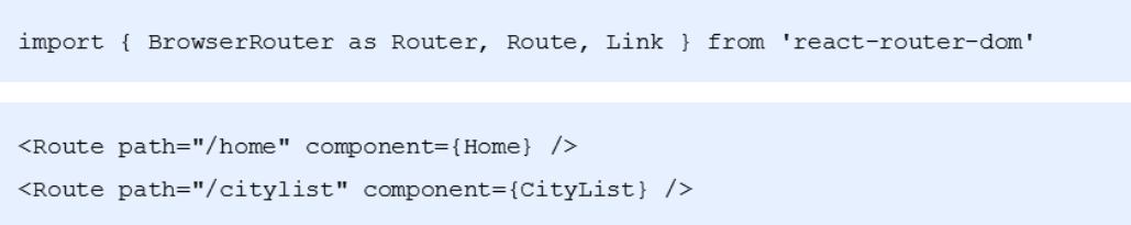
配置路由
- 安装 yarn add react-router-dom
- 导入路由组件:Router / Route / Link
- 在 pages 文件夹中创建 Home/index.js 和 CityList/index.js 两个组件
- 使用 Route 组件配置首页和城市选择页面
外观和样式调整
- 修改页面标题,在 index.html 里面修改
- 基础样式调整,在 index.css 中调整
项目整体布局
两种页面布局
- 有 TabBar 的页面: 首页、找房、资讯、我的
- 无 TabBar 的页面:城市选择等
- TabBar 的菜单也可以实现路由切换,也就是路由内部切换路由(嵌套路由)

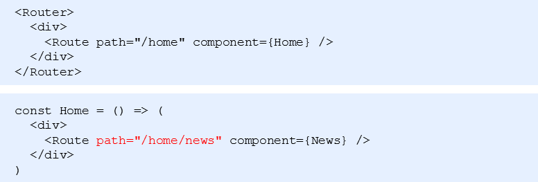
嵌套路由(★★★)
- 嵌套路由:路由内部包含路由
- 用 Home 组件表示父路由的内容
- 用 News 组件表示子路由的内容
使用步骤
- 在 pages 文件夹中创建 News/index.js 组件
- 在 Home 组件中,添加一个 Route 作为子路由的出口
- 设置嵌套路由的 path,格式以父路由 path 开头(父组件展示了,子组件才会展示)
- 修改 pathname 为 /home/news,News 组件的内容就会展示在 Home 组件中了
实现 TabBar(★★★)
拷贝 TabBar 组件结构
- 打开 antd-mobile 组件库中 TabBar 的组件文档
- 选择 APP 型选项卡菜单,点击
</>显示源码 - 拷贝核心代码到 Home 组件中(Home 是父路由组件)
- 调整代码
修改 TabBar 组件样式
- 修改 TabBar 菜单项文字标题
- TabBar 的文字标题在 TabBar.Item 的 title 属性中,所以我们修改对应四个 title 属性即可
1 | <TabBar.Item |
- 修改 TabBar 菜单文字标题颜色
- TabBar 菜单选中的文字颜色在 TabBar 的 tintColor 属性中设置
- 未选中文字颜色用默认的即可,删除 TabBar 中的 unselectedTintColor 属性
1 | <TabBar |
- 使用字图图标,修改 TabBar 菜单的图标
- 字体图标的 资源在课件的素材中,直接复制过来即可
- 在 index.js 里面引入字体图标的 css 样式文件,这样我们只需要在组件中设置对应的类名即可,icon 代表是默认图标,selectedIcon 代表是选中的图标
1 | <TabBar.Item |
修改 TabBar 菜单项的图标大小
- 在当前组件对应文件夹中创建 index.css 文件,修改一下字体图标的大小,设置为 20px(注意,在 home.js 中记得导入当前的样式)
调整 TabBar 的位置,固定在最底部
- 通过调试工具我们发现,底部的 TabBar 的类名叫 am-tab-bar-bar,所以我们只需要设置一下这个类名的属性即可
去掉 TabBar 的徽章
- 找到 TabBar.Item 里面对应的 badge 属性,删除即可
TabBar 配合路由实现
- 根据 TabBar 组件文档设置不渲染内容(只保留菜单项,不显示内容)
- 给 TabBar 设置 noRenderContent 属性即可
1 | <TabBar |
- 给 TabBar.Item 绑定点击事件,在点击事件逻辑里面利用编程式导航,进行路由的切换
- 利用 this.props.history,push() 来实现
1 | <TabBar.Item |
- 创建 TabBar 组件菜单项对应的其他 3 个组件,并在 Home 组件中配置路由信息
- 创建对应的组件,然后在 home.js 中进行导入,最后配置一下路由
1 | {/* 配置路由信息 */} |
给菜单项添加 selected 属性,设置当前匹配的菜单项高亮
- 通过 this.props.location.pathname 就能拿到当前的路由的 path
- 在 TabBarItem 里面设置 selected 的属性,判断是否等于当前的 pathname
- 在 state 中记录当前的 pathname
1
2
3
4
5state = {
// 选中的菜单项,记录当前的pathname来匹配对应的tab
selectedTab: this.props.location.pathname,
}- 在每个 TabBar.Item 里面利用 selected 属性判断一下
1 | <TabBar.Item |
TabBar 代码的重构
- 发现 TabBar 的 Iitem 里面的内容几乎是一致的,只是里面内容不同
- 所以我们可以封装一下
- 提供菜单数据
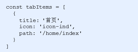
- 使用 map 来进行遍历
声明一下数据源
1 | const tabItems = [{ |
封装一个函数来遍历渲染
1 | renderTabBarItem() { |
在 render 方法中调用即可
1 | render() { |
首页实现(★★★)
- 首页的路由是需要去处理的
- 修改首页路由的配置: /home(去掉后面的 index);这里需要添加 exact 属性
- 如果是默认路由需要跳转到 /home

1 | {/* 配置默认路由 */} |
喜欢这篇文章的人也看了
评论
匿名评论隐私政策